

Compare Costs and Trends Over Time
See how your costs have changed compared to a previous period. Explorer offers two comparison tools: Cost Trends for a quick default summary and Compare Periods for full control over which period to compare and how the results are visualized.
Cost Trends
Cost Trends shows how your spend compares to the previous period. It is on by default; Explorer compares your selected time range against the preceding period of the same length.
When enabled, Explorer adds:
- Compared to previous X days summary above the chart
- Cost of Change and % of Change columns in the cost table
When disabled, these values are hidden.
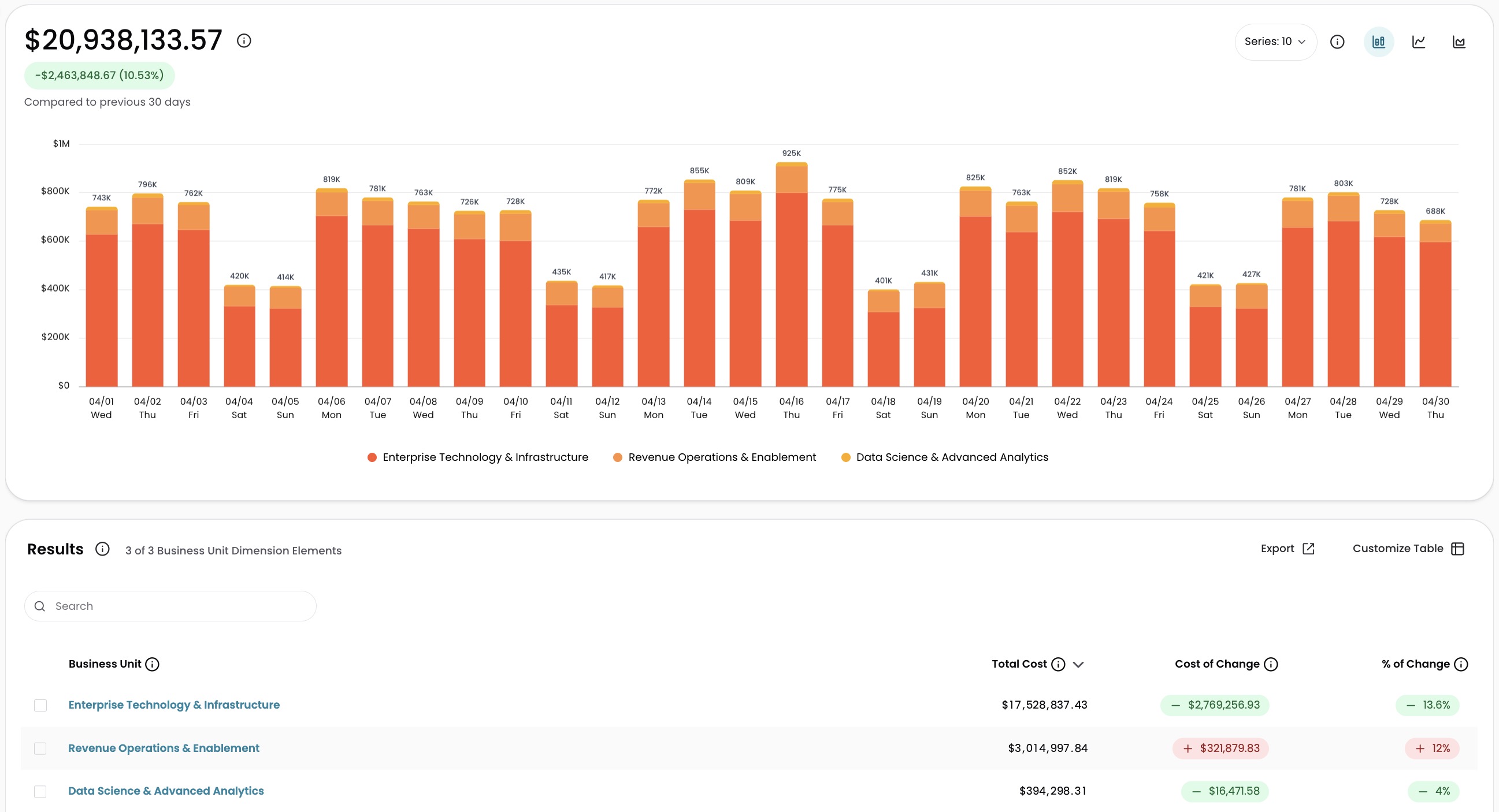
Turn Cost Trends on or off
Each user controls the toggle independently.
- In Explorer, click Customize Table under the Results table.
- Click Cost Trends to turn trends on or off.
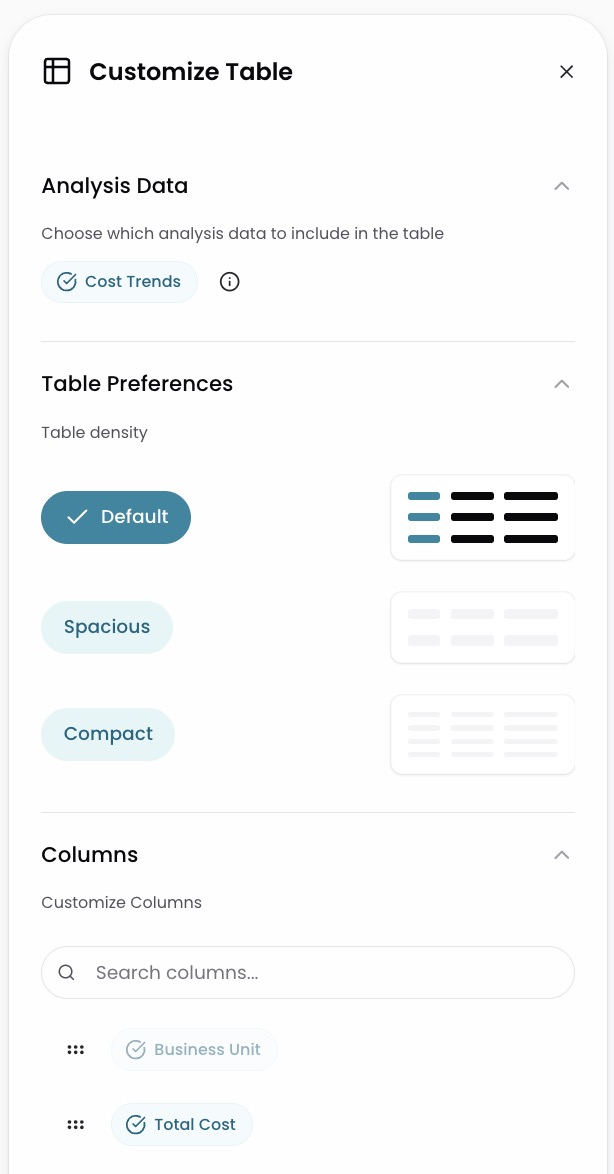
When to disable Cost Trends
Disabling Cost Trends reduces the data Explorer needs to retrieve, which significantly improves load times for larger time ranges.
Disable Cost Trends when:
- You are analyzing longer lookback periods and want faster load times
- You are focused on the current period's spend and do not need a comparison
Enable Cost Trends when:
- You want to see period-over-period cost changes
- You are reviewing Cost of Change and % of Change in the cost table
For more on how Cost of Change works, see Explorer Overview.
Change the default for all users
Administrators can set whether Cost Trends starts on or off for all users.
- Go to Settings > Organization Settings.
- Toggle Show Trends by Default in Explorer under Explorer Trends Default.
Requires Organization Administration write permission. For details, see Users and Permissions.
Compare Periods
Spot spikes, regressions, and shifts in spend by comparing two time periods in Explorer. Compare Periods shows the difference between your base period and a compared period, both visually on the chart and numerically in the cost table.
- In Explorer, click Compare in the toolbar.
- Select a comparison period from Quick picks: Prev. Period, Week Ago, Month Ago, Quarter Ago, or Year Ago.
- Choose a display mode from Chart Display: Aligned, Delta, or Split.
- (Optional) To set a custom comparison range or change the base range, click the expand icon to open the full Compare panel.
- To close the comparison, click the X on the Compare button.
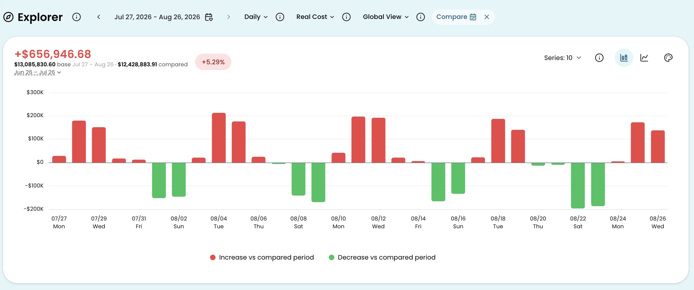
The cost summary above the chart updates to show both periods: the base period total, the compared period total, and the dollar and percentage difference.
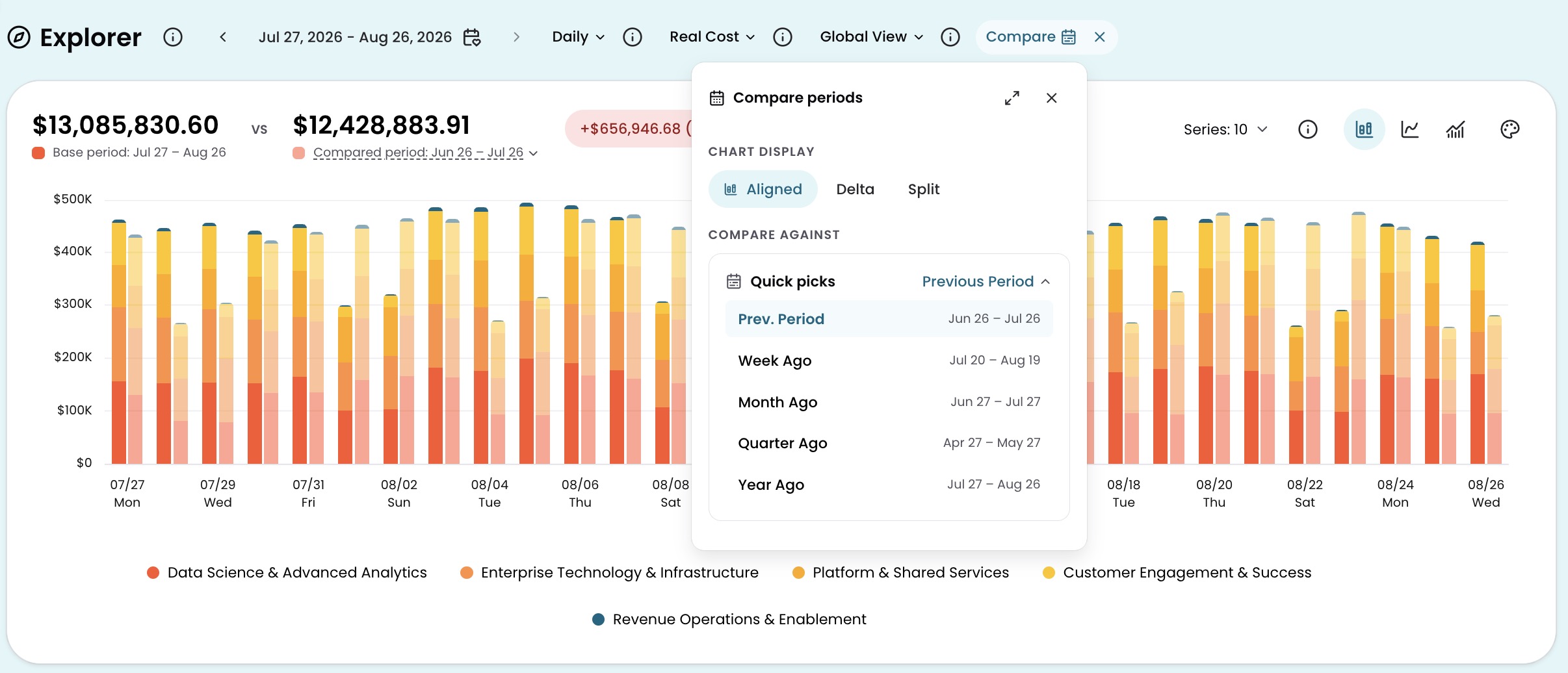
Display modes
Three display modes control how the comparison chart is rendered. Select a mode from the Chart Display toggle in the Compare panel. Within each mode, toggle between chart types using the icons in the chart header.
Aligned (default): Both periods appear on the same chart for direct interval-by-interval comparison.
- Bar: Both periods render as grouped paired bars per interval, with the compared period in subdued tones so the base period stands out.
- Line: The base period appears as a solid line and the compared period as a dashed line on a shared timeline.
- Mixed: The base period renders as stacked bars with the compared period total as a line overlay.
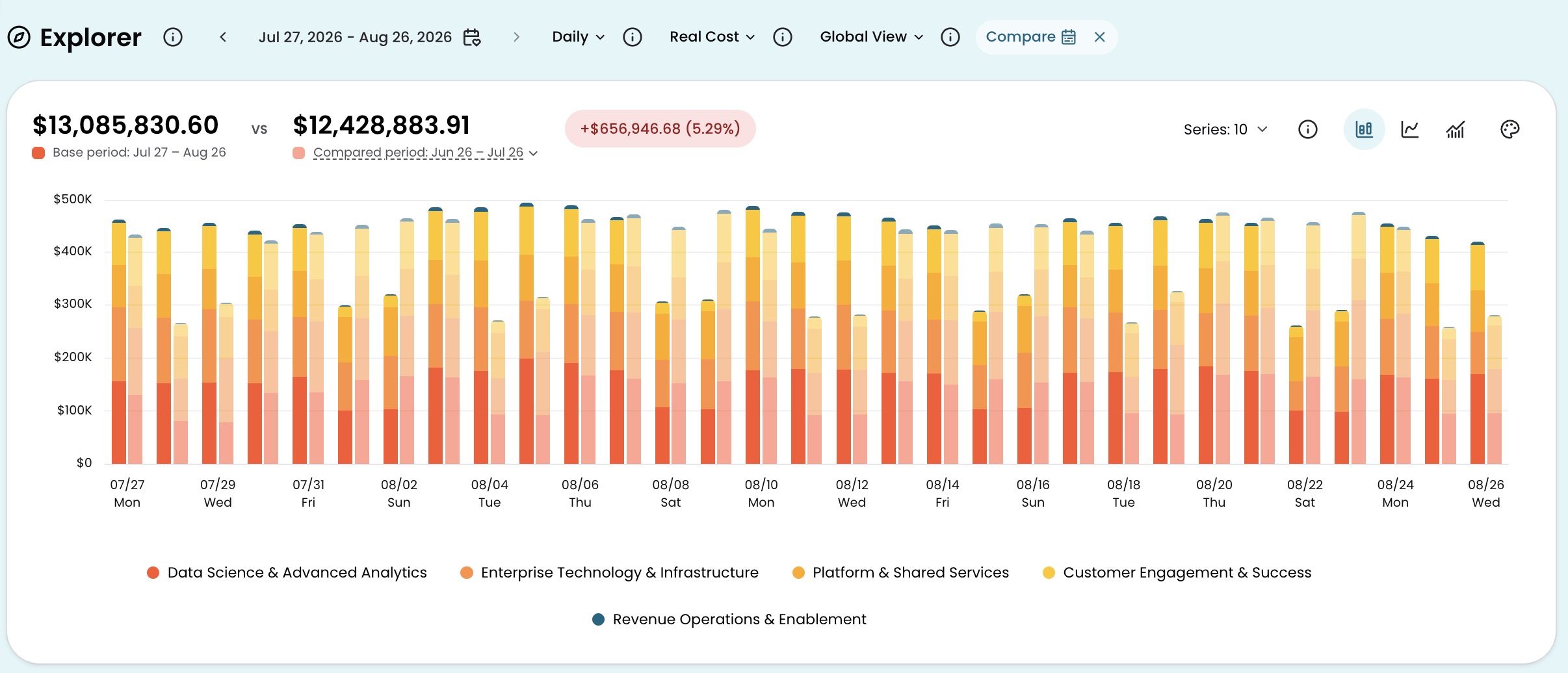
Delta: Shows the cost difference between periods per interval. Cost increases appear in red; decreases appear in green.
- Bar: A diverging bar chart shows the net change per interval, with increases above the zero baseline and decreases below.
- Line: Individual lines show each service's contribution to the cost change, with a dashed line for the net total across all services.
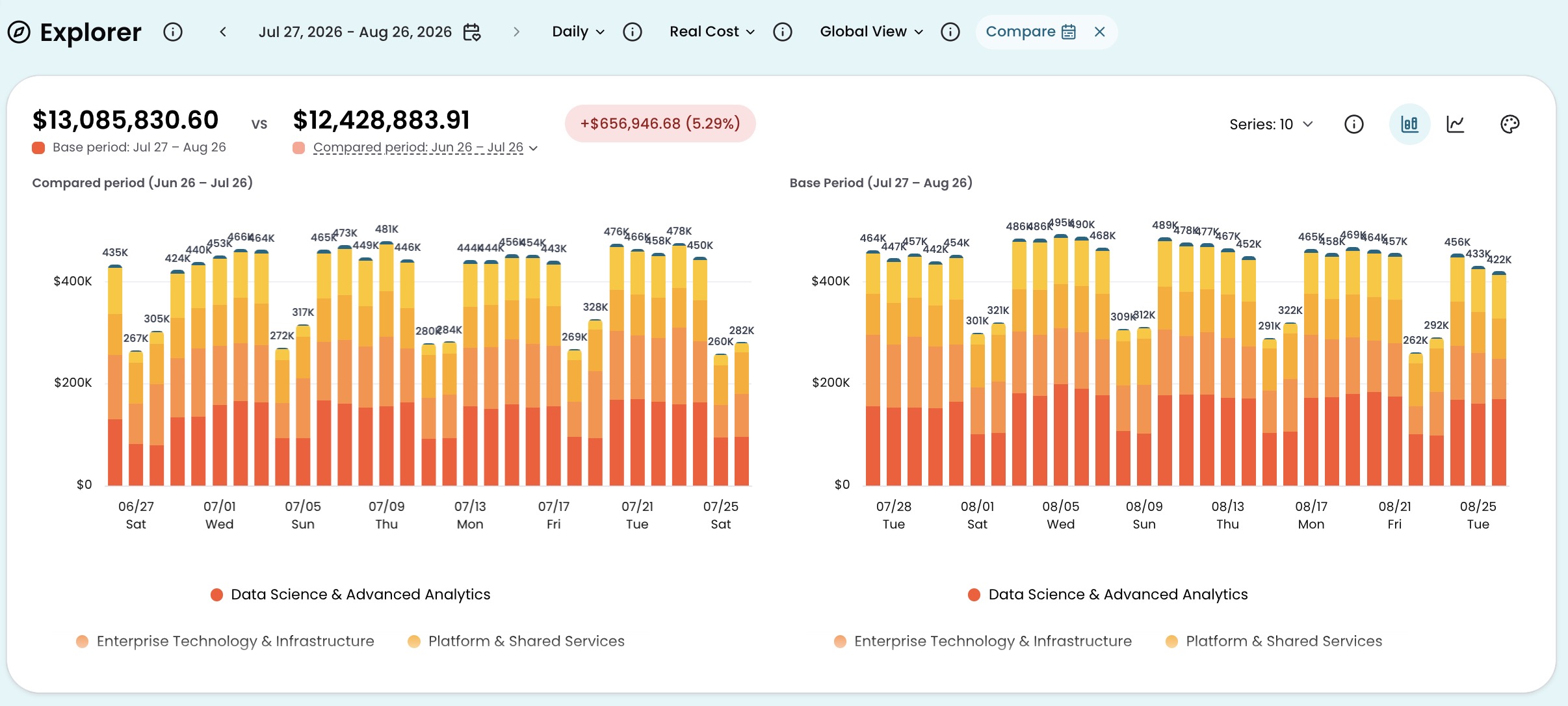
Split: Two independent charts rendered side by side with matched y-axis scales. The compared period appears on the left and the base period on the right.
- Bar: Both charts render as independent stacked bar charts.
- Line: Both charts render as independent line charts.
Comparison table columns
When a comparison is active, the cost table adds columns for the compared period:
- Base Cost: The total cost for each row during the base period, based on the selected Cost Type.
- Compared Cost: The total cost for each row during the compared period, based on the selected Cost Type.
- Cost Difference: The difference in cost between the base period and the compared period. Red indicates an increase; green indicates a decrease.
- % of Change: The percentage change in cost between the base period and the compared period, relative to the compared cost. Red indicates an increase; green indicates a decrease.
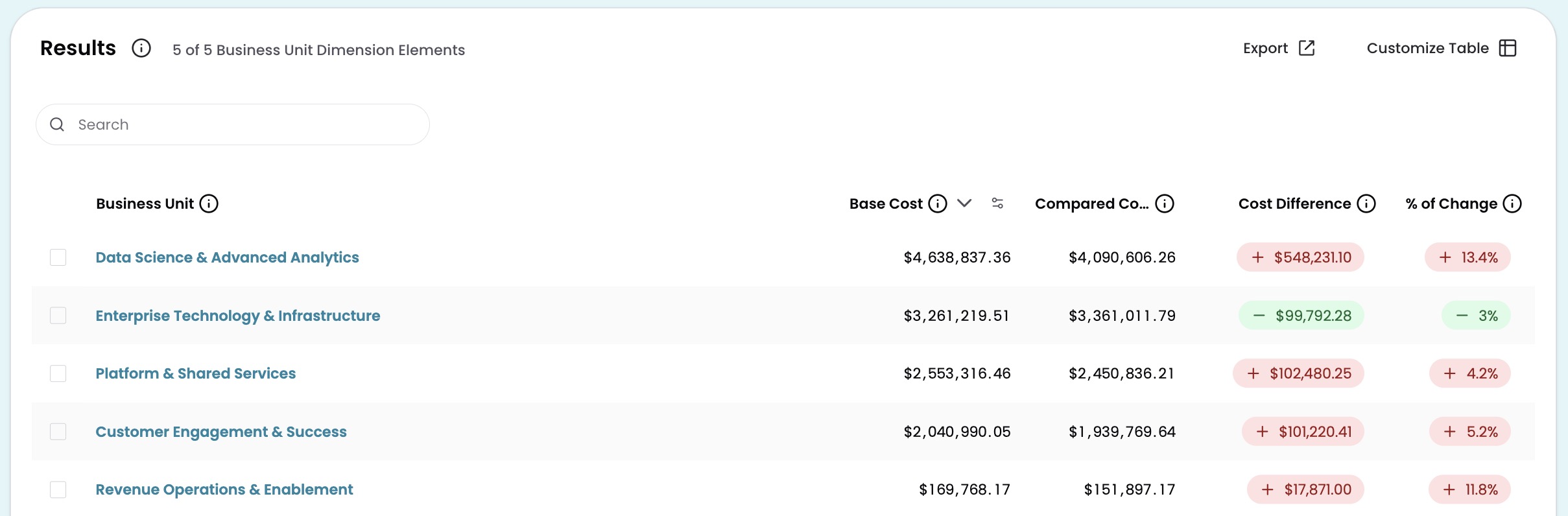
Click any comparison column header to sort the table by that column.
Share a comparison
Comparison settings are saved in the URL. When you share or bookmark a link from Explorer with a comparison active, anyone opening that link sees the same comparison.
Have questions or feedback? Reach out to your account manager.
Updated about 2 months ago