Viewing Usage Data in Explorer
Explorer shows cost and usage side by side across all your connected providers, so you can answer "what drove this cost?" without leaving the page. When costs change, usage data tells you whether the change came from higher consumption or higher rates, helping you separate expected growth from spending that needs a closer look.
There are two ways to work with usage data in Explorer: usage columns in the cost table and a usage overlay on the chart.
Usage columns in the cost table
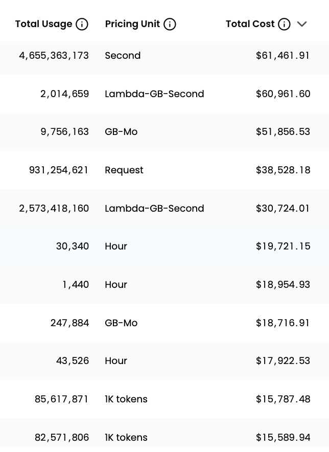
When you drill down to individual resources in Explorer, two additional columns appear in the results table:
- Total Usage: how much of that resource was consumed over the selected time period (for example, 4,655,363,173 Seconds or 931,254,621 Requests)
- Pricing Unit: the billing unit for that consumption (for example, Second, GB-Mo, Hour, or 1K tokens)
These columns are always on at the resource level. No configuration is needed.
A single resource can have costs across multiple pricing units. When it does, Explorer shows a separate row for each pricing unit so you can see exactly where the cost comes from.
To remove this breakdown and see one row per resource, open Customize Table and deselect the usage columns. Both columns are included in exports.
Overlay usage on the chart
When you drill down to individual resources in Explorer, a View Usage dropdown appears in the chart controls. The chart shows cost by default. Opening View Usage lets you overlay usage on top of the cost bars so you can see both on the same chart.
Usage appears on a secondary Y-axis so you can visually compare cost and usage trends over the same time period. Costs and usage rising together is expected; costs rising with usage flat is worth investigating.
Step 1: Open the View Usage dropdown
The dropdown has two tabs:
- By Total Pricing Unit (default): aggregates all usage metrics for a given pricing unit and overlays the total as a single line. Use this to see overall usage trends for a specific pricing unit.
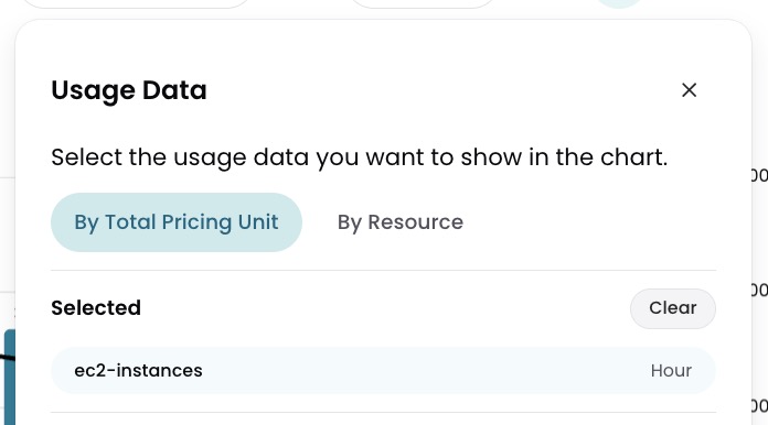
- By Resource: lets you select a single resource and overlay its usage. Use this to correlate one specific resource's usage with its cost over time.
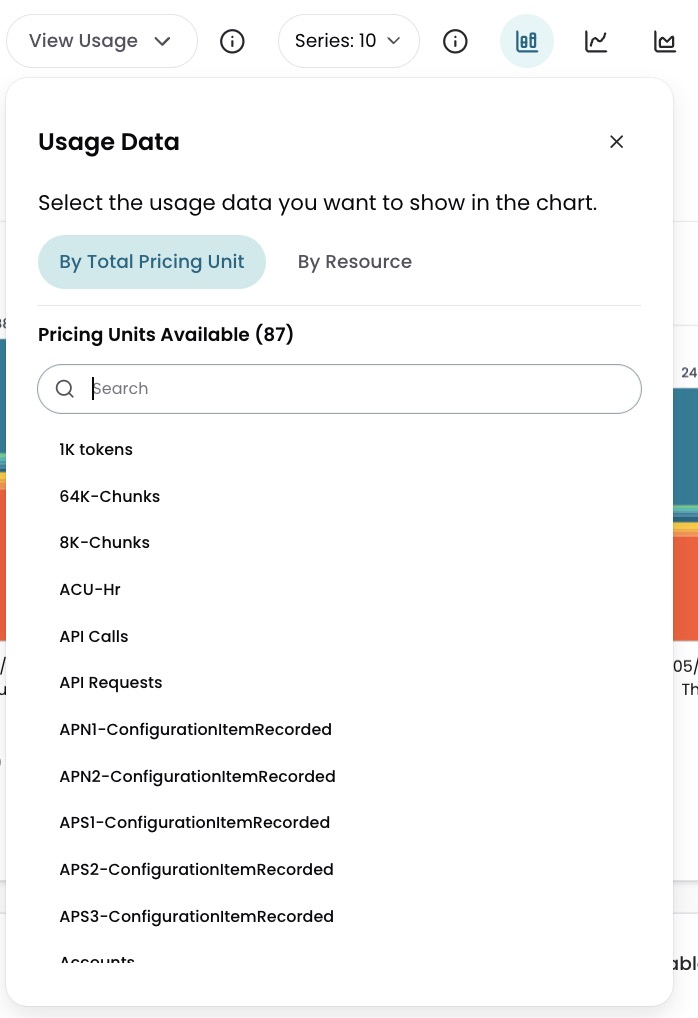
Step 2: Select a usage option
Select a pricing unit or a specific resource from the list. The chart overlays a usage line on the cost bars immediately.
Step 3: Clear the overlay
To return to cost only, select Clear in the View Usage dropdown or select Clear Usage at the bottom right of the chart. The secondary Y-axis is removed and the chart resets to its default state.
Have questions or feedback? Reach out to your account manager.
Updated about 1 month ago